B2B Website Trust Signals: What Makes Visitors Choose You Over Competitors
Someone just landed on your website. They've never heard of your organization. They don't know your mission, your team, or your track record.
In the next few seconds, they'll decide whether you're credible. Not by reading your About page. Not by reviewing your financials. By looking at your site and making a gut-level judgment about whether you seem legitimate.
This isn't speculation. Stanford's Web Credibility Research found that 75% of users judge an organization's credibility based on website design. That finding has held up for over two decades because the underlying psychology hasn't changed. People trust what looks trustworthy.
For mission-driven organizations like nonprofits, churches, and HOAs, trust is the foundation of everything. Donors trust you with their money. Congregants trust you with their community. Homeowners trust you with their neighborhood. If your website undermines that trust before anyone picks up the phone, you've lost them.
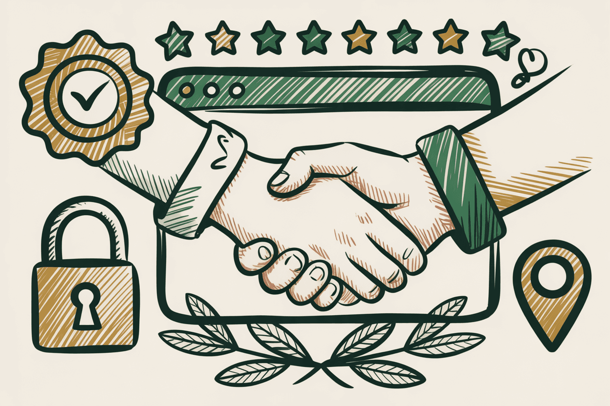
10 Trust Signals That Build Credibility
1. Professional, Consistent Design
Mismatched fonts, broken layouts, and outdated aesthetics don't just look bad. They signal incompetence. If your organization can't maintain a coherent website, visitors wonder what else you can't maintain.
Consistency matters. Same colors, same fonts, same button styles across every page. A visitor should feel like they're in the same place whether they're on your homepage or your events calendar. Visual consistency communicates organizational competence.
2. Real Photos of Real People
Stock photos are instantly recognizable. The smiling multiracial group of professionals shaking hands around a conference table? Everyone has seen it. It feels manufactured because it is.
Use photos of your actual team, your actual community, your actual events. A slightly imperfect photo of a real volunteer is infinitely more trustworthy than a perfect photo of a paid model. If you don't have good photos, invest in a professional shoot. It's worth every dollar.
3. Physical Address and Phone Number
Organizations that hide their location seem sketchy. Full stop.
Put your physical address and phone number in your website footer on every page. If you're a nonprofit, church, or HOA, you have a real location. Show it. Include a Google Maps embed on your contact page. Make it easy for someone to confirm you actually exist in a physical space.
4. Financial Transparency
For nonprofits, this is a major trust builder. Link to your GuideStar/Candid profile. Publish your annual report (or at least a summary). Display your 501(c)(3) status and EIN. Let visitors verify your legitimacy independently.
Organizations that are open about finances signal confidence. Organizations that hide financial information, even if they have nothing to hide, create suspicion. Transparency is a competitive advantage.
5. Social Proof
Testimonials from real people with real names. Partner organization logos. Media mentions. Case studies with actual numbers, not vague claims of "making a difference."
"We increased after-school program enrollment by 40% in one year" is social proof. "We are committed to excellence in youth development" is just words. Specificity creates believability.
If you have client testimonials, use them. If you've been featured in local media, link to it. If partner organizations endorse your work, show their logos. Every piece of verifiable social proof moves a visitor closer to trust.
6. SSL Certificate and Security Indicators
The padlock icon in the browser bar matters more than you'd expect. Visitors may not understand what SSL does technically, but they've been trained to look for it. A site without SSL triggers a browser warning that says "Not Secure" in plain text. That kills trust instantly.
Every reputable hosting provider offers free SSL certificates through Let's Encrypt. There's no excuse for not having one. If you're not sure whether your site has SSL, check whether your URL starts with "https." If you need a refresher on what SSL does and why it matters, we've broken it down.
7. Accessibility
A website that works for everyone signals two things: competence and care. When someone using a screen reader can navigate your site, when your color contrast passes WCAG standards, when your forms are keyboard-accessible, you're communicating that your organization takes inclusion seriously.
This isn't just a nice signal. For nonprofits and churches that talk about serving everyone, an inaccessible website is a contradiction of mission. Your site should back up your words. Learn more about what makes a good nonprofit website accessible and effective.
8. Fresh Content
An outdated blog with the last post from 2023 tells visitors your organization might be inactive. A copyright year that reads "2024" in 2026 says nobody's minding the store.
You don't need to blog weekly. But your site should show signs of life. Update your copyright year automatically. Post quarterly updates at minimum. Keep event listings current. Remove expired content. A stale website is a trust liability.
9. Clear Contact Options
Multiple ways to reach you. Email, phone, contact form. If you have office hours, state them. If you typically respond within 24 hours, say that.
Organizations that make contact difficult seem like they don't want to be contacted. That's a terrible signal for any entity that depends on community engagement. Make it easy. Put contact information on every page, not just the contact page.
10. Fast Load Times
Slow sites feel untrustworthy. This isn't just perception. Google's research confirms that as page load time increases from 1 second to 3 seconds, bounce probability increases by 32%. At 5 seconds, it increases by 90%.
A visitor waiting for your page to load is a visitor forming a negative impression. Speed communicates competence. If your site is slow, read about the real cost of a slow website and take it seriously.
Trust Killers: What Drives Visitors Away
Building trust is a slow process. Destroying it is instant. Here are the things that make visitors leave.
Broken Links
Clicking a link that leads to a 404 error feels like walking into a store and finding empty shelves. One broken link is a minor annoyance. Multiple broken links suggest abandonment. Run a link checker quarterly, at minimum.
Outdated Information
Old staff bios for people who left two years ago. Event listings for things that already happened. Phone numbers that ring to disconnected lines. Every outdated detail erodes trust incrementally.
Stock Photos Everywhere
One or two tasteful stock images in supporting roles is fine. An entire site built on stock photography feels hollow. Visitors can tell the difference between a photo of your actual team and one you purchased for $12.
No SSL Certificate
As mentioned above, this triggers a browser warning. In 2026, there's no reason for any legitimate organization to lack SSL. Its absence is a red flag that visitors take seriously.
Hidden Pricing or Vague CTAs
"Contact us for a quote" with no pricing context whatsoever creates friction and suspicion. You don't need to publish exact pricing for every service. But giving ranges, starting-at figures, or clear tiers respects your visitors' time and signals honesty.
For nonprofits and churches, this translates to donation forms: be transparent about how funds are used. Don't just ask for money. Show where it goes.
Pop-Up Overload
One well-timed newsletter popup is acceptable. Three popups stacked on top of each other within 10 seconds of arriving? That's hostile. Exit-intent popups, scroll-triggered modals, and cookie banners all competing for attention at once makes a visitor feel ambushed, not welcomed.
Auto-Playing Media
Nothing erodes trust faster than a video that starts blaring audio the moment a page loads. It feels invasive. It's an accessibility problem. And it sends visitors scrambling for the back button. Always let visitors choose to play media.
The Trust Gap: Mission vs. Execution
Here's a pattern we see often with mission-driven organizations. The people running the organization are deeply competent, passionately committed, and doing genuinely important work. But their website doesn't reflect any of that.
The disconnect between who you are and how your website presents you is what we call the trust gap. A brilliant executive director leading a life-changing program deserves a website that matches their impact. Instead, they're working with a site that was built by a volunteer five years ago and hasn't been updated since.
This gap costs real money. Donors who would have given don't. Volunteers who would have signed up bounce. Community members who need your services can't find them. The trust gap isn't about vanity. It's about lost opportunity.
Closing the gap doesn't require a six-figure redesign. It requires honest assessment of where your site falls short on the trust signals above, followed by methodical improvement. Start with the items that are cheapest to fix and most visible to visitors.
Why Design Credibility Isn't Vanity
Some organizations push back on investing in professional web design. "We're a nonprofit, not a corporation. Our work speaks for itself."
Your work doesn't speak for itself online. Your website speaks for your work. And if your website looks like it was built in 2015 and hasn't been touched since, visitors draw conclusions about your organizational health, whether those conclusions are fair or not.
Stanford's 75% figure isn't about aesthetics for the sake of aesthetics. It's about credibility driving action. A visitor who trusts you is a visitor who donates, volunteers, joins, or contacts you. A visitor who doesn't trust you bounces, and they rarely come back.
Investing in trust signals isn't vanity. It's conversion. Every element on this list directly impacts whether a visitor takes the action you want them to take.
Start With the Basics
You don't need to overhaul everything at once. Start with the highest-impact items:
This week: Check that you have SSL. Update your copyright year. Remove any broken links from your homepage and main navigation.
This month: Replace your worst stock photos with real ones. Add your physical address and phone number to every page footer. Add or update testimonials.
This quarter: Audit your site for accessibility. Update your content. Review your design for consistency. Publish your financials or link to your GuideStar profile.
Each improvement moves the needle on credibility. And credibility is what turns a website visitor into a supporter, member, or client.
Sources
- •Stanford Web Credibility Research — Stanford Persuasive Technology Lab
- •Find Out How You Stack Up to New Industry Benchmarks for Mobile Page Speed — Google / Think with Google
- •Trust and Credibility on the Web — Nielsen Norman Group
- •Nonprofit Website Best Practices — National Council of Nonprofits
- •Let's Encrypt: Free SSL/TLS Certificates — Internet Security Research Group