What Makes a Good Nonprofit Website: 12 Features That Drive Donations

A nonprofit website isn't a brochure. It's a front door, a fundraising tool, a volunteer recruiter, and a trust signal rolled into one. When someone Googles your organization for the first time, your website decides whether they donate, volunteer, or close the tab.
So what separates the nonprofit websites that actually work from the ones that just exist? Here are the 12 features that matter most.
1. A Mission Statement You Can Read in 5 Seconds
Your mission statement belongs above the fold on your homepage. Not buried in an "About" page. Not hidden behind a carousel. Visible the moment someone lands on your site.
It should be one sentence. Maybe two. Written in plain language. "We provide after-school tutoring to underserved students in Metro Atlanta" tells a visitor everything they need to know. "Leveraging community-based paradigms to optimize educational outcomes for youth populations" tells them nothing.
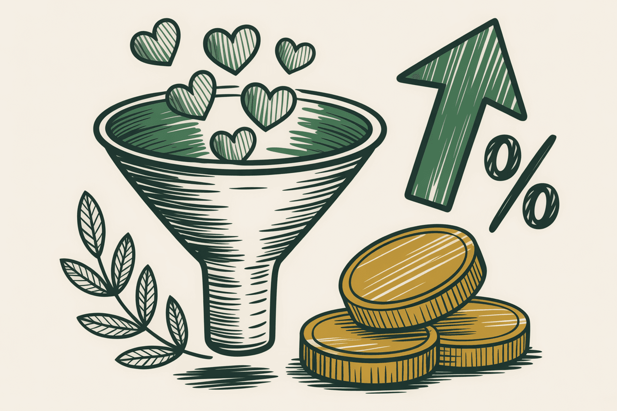
2. Mobile-Optimized Donation Flow
Over half of nonprofit website visitors come from mobile devices, and that number climbs every year. If your donation form doesn't work perfectly on a phone, you're losing donations.
Mobile-optimized means large touch targets on buttons. A short form with minimal fields. Suggested donation amounts ($25, $50, $100) displayed as tappable buttons rather than a blank text field. And a form that loads fast. A donation page that takes five seconds to load on cellular data will lose half its potential donors before the page even appears.
Test your donation page on your own phone. If you'd abandon it, your donors will too.
3. Fast Load Times
Speed isn't a nice-to-have. It's a conversion multiplier. Sites loading in 2 seconds versus 5 seconds see dramatically higher engagement and conversion rates.
For nonprofits, speed especially matters because your audience includes people on older phones, slower connections, and rural internet. If your site is bloated with unoptimized images and heavy scripts, you're excluding the communities you may be trying to serve.
4. Accessibility for Every Visitor
One in four US adults has a disability. That's 70 million people. And they're visiting your website.
When a blind person using a screen reader can't navigate your site, they can't learn about your programs, apply for your services, or donate to your cause. When someone with a motor disability can't complete your volunteer signup because the form isn't keyboard-accessible, your website is a barrier, not a bridge.
Accessibility isn't an add-on feature. It should be built into every page from the start.
5. Trust Signals That Build Donor Confidence
Before someone donates, they need to trust you. Your website either builds that trust or erodes it.
Effective trust signals include a visible physical address and phone number, your 501(c)(3) status clearly stated, board of directors listed by name, financial transparency (annual report or GuideStar profile link), real photos of your team and your work, and third-party validation like accreditations or media mentions.
The most underrated trust signal? A professional, well-maintained website itself. If your site looks like it was built in 2015, visitors question whether the organization is still active.
6. Clear Calls to Action on Every Page
Every page should answer one question: "What should I do next?"
On the homepage: "Donate Now" or "Get Involved." On a program page: "Apply for This Program." On an about page: "Meet Our Team." The donate button should be visible in the navigation on every page.
But restraint matters too. One primary action per page. If you ask visitors to donate AND volunteer AND subscribe AND attend an event all at once, they'll do none of those things.
7. Program Pages That Explain What You Actually Do
Too many nonprofit websites talk about the mission without explaining what the organization actually does day-to-day.
Every program deserves its own page with a clear description written for the people you serve (not your grant funder), who's eligible, how to access it, location and schedule, impact data if you have it, and a way to take the next step.
8. SEO Basics So People Can Find You
Organic search is the single largest source of nonprofit website traffic. If your site isn't optimized, you're invisible to nearly half your potential audience.
Every page needs a unique title tag. Every page needs a meta description. Your pages should use proper heading structure. Your images should have descriptive alt text. If you're a local nonprofit, claim your Google Business Profile and include your city in your content naturally.
9. A Blog or News Section (That You Actually Update)
A blog gives search engines fresh content to index and gives supporters a reason to keep coming back. Once or twice a month is plenty. Share impact stories, program updates, or volunteer spotlights.
The catch: an abandoned blog is worse than no blog. If your most recent post is from 18 months ago, it signals the organization is inactive. If you can't commit to updating it, don't add one.
10. Social Proof Through Storytelling
Data tells donors you're effective. Stories tell donors you're worth caring about. You need both.
Impact numbers belong on your site. But pair those numbers with real stories. A quote from a program participant. A volunteer explaining why they keep coming back. And real photos from your events, not stock photos. The difference in emotional impact is enormous.
11. A Consistent, Professional Design
Your design doesn't need to be flashy. It needs to be clean, consistent, and intentional. One or two font families. A limited color palette. Consistent spacing. Images in the same style across the site.
Consistency signals competence. If your homepage uses one font, your about page uses another, and your donation page uses a third, visitors notice.
12. Technical Security and Reliability
Your website needs an SSL certificate (HTTPS). This is non-negotiable. Make sure your site is backed up regularly, your CMS is kept updated, and your forms have spam protection.
If your site goes down on the day of your annual fundraiser, that's lost revenue. Reliability isn't glamorous, but it's essential.
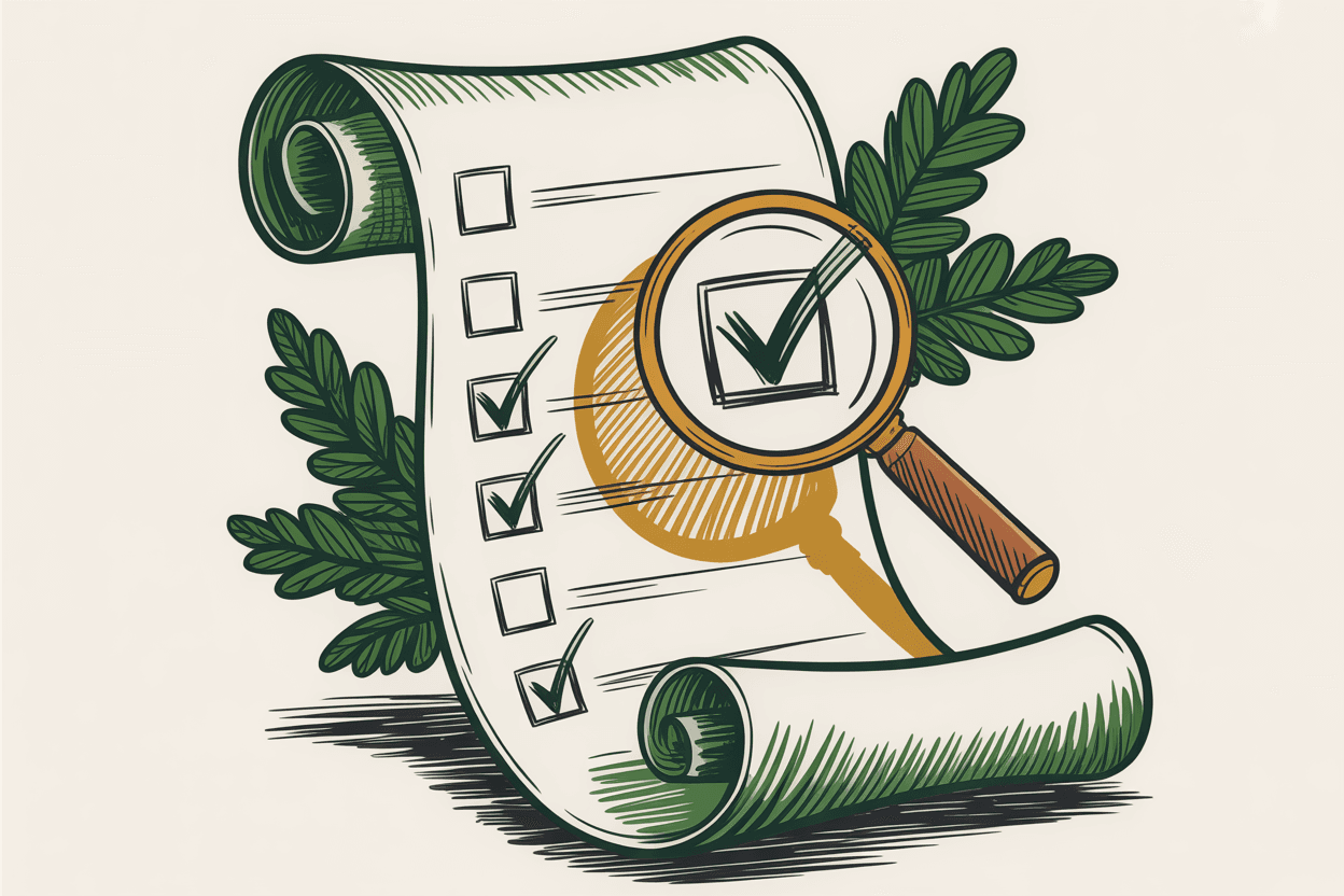
Where to Start
If this list feels overwhelming, start with three things. Put your mission statement above the fold. Test your donation form on a phone. And run a free accessibility check using the axe browser extension.
Those three actions take less than an hour and address the highest-impact areas. Everything else can follow as time and budget allow.