Nonprofit Website Accessibility: The Complete WCAG Compliance Guide
Your nonprofit exists to serve a community. Maybe it's people experiencing homelessness, families navigating immigration, or seniors aging in place. Whatever the mission, there's a good chance that a significant portion of the people you serve have disabilities.
One in four American adults lives with a disability. That's 70 million people. And if your website doesn't work for them, you're shutting the door on the community you set out to help.
Nonprofit website accessibility isn't a nice-to-have feature you tack on at the end of a redesign. It's a core part of doing your job well. This guide walks you through exactly what's required, why it matters for your specific type of organization, and how to get it done without blowing your budget.
Why Accessibility Matters More for Nonprofits
Most conversations about web accessibility focus on legal risk. That matters, and we'll cover it. But for nonprofits, the case starts somewhere deeper.
Your organization's entire reason for existing is to help people. When a blind donor can't complete your online giving form, that's not just a technical bug. It's a mission failure. When a deaf volunteer can't watch your orientation video because there are no captions, you've excluded someone who wanted to give their time to your cause.
People with disabilities are donors, volunteers, board members, program participants, and community advocates. They're not an edge case. They're your people.
Beyond mission alignment, there are practical reasons accessibility should be at the top of your list.
It expands your reach. Accessible websites work better for everyone, not just people using assistive technology. Clear headings help search engines understand your content. Captions help people watching videos in a noisy environment. Good color contrast helps people reading on their phones in direct sunlight. Good accessibility is good design.
It protects your funding. If your nonprofit receives federal funding, Section 508 applies to you. More on that below.
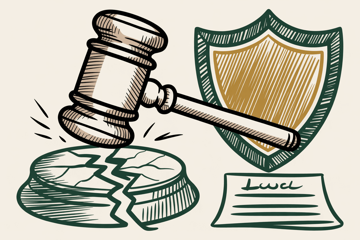
It reduces legal exposure. ADA lawsuits against websites have increased every year since 2018. Nonprofits are not exempt. Plaintiff attorneys specifically target organizations with public-facing digital services.
It improves your SEO. Many accessibility best practices (proper heading structure, descriptive alt text, clean HTML) are also SEO best practices. You're not choosing between accessibility and visibility. You get both.
The Legal Landscape for Nonprofits
The legal requirements depend on what kind of nonprofit you are and where your funding comes from.
ADA Title III: Public Accommodations
If your nonprofit operates a place of public accommodation (a shelter, clinic, community center, museum, theater), the ADA likely applies to your website. Courts have increasingly interpreted "places of public accommodation" to include the digital services those places offer.
There is no official ADA web standard written into the statute. But courts have consistently pointed to WCAG 2.1 AA as the benchmark. When a judge asks "is this website accessible?", WCAG 2.1 AA is the yardstick they reach for.
Section 508: Federal Funding Recipients
If your nonprofit receives any federal funding (grants, contracts, subcontracts), Section 508 of the Rehabilitation Act applies. This is more specific than the ADA. Section 508 explicitly requires conformance with WCAG 2.0 AA for electronic and information technology, and the standard is moving toward WCAG 2.1.
This catches more nonprofits than you'd expect. Community health centers, Head Start programs, housing authorities, workforce development organizations, and disaster relief agencies all commonly receive federal dollars. If you take the money, you take the obligation.
ADA Title II: Government-Adjacent Organizations
Some nonprofits operate so closely with government agencies that they fall under ADA Title II. If your organization administers government programs, operates under a government contract, or functions as an extension of a state or local government entity, the new Title II web accessibility rule may apply directly to you.
Title II now explicitly requires WCAG 2.1 AA compliance with specific deadlines. If you think your organization might fall into this category, it's worth understanding the requirements before the deadlines arrive.
State Laws
Several states have their own digital accessibility requirements. California, New York, and Illinois have been particularly active in this space. Your state attorney general's office can clarify what applies to your organization specifically.
What WCAG 2.1 AA Requires (The Nonprofit Version)
WCAG can feel overwhelming when you read it as a technical specification. But the core requirements are straightforward when you translate them into nonprofit website terms. Here's what you need to get right.
Images and Alt Text
Every image on your site needs a text alternative that conveys the same information the image does. This is how screen reader users experience your visual content.
What this looks like on a nonprofit site:
- A photo of volunteers at a food bank: "Six volunteers sort canned goods at the Downtown Food Bank's Saturday distribution event."
- Your logo in the header: "Sunrise Community Foundation" (the organization name, not "logo").
- A decorative divider between sections: Empty alt text (`alt=""`), because it carries no meaning.
- An infographic showing your impact: A detailed description of the data, either in the alt text or in a text paragraph nearby.
The most common failure on nonprofit sites is stock photos with alt text like "IMG_4532.jpg" or "photo" or no alt text at all. Every informational image needs a description that would make sense to someone who can't see it.
Heading Structure
Headings aren't just visual formatting. They're the navigation system for screen reader users. A screen reader user can pull up a list of all headings on your page and jump directly to the section they want. If your headings are out of order or missing, that navigation breaks completely.
The rules are simple:
- One H1 per page (your page title).
- H2 for main sections.
- H3 for subsections within an H2.
- Never skip levels (don't jump from H2 to H4).
- Never use headings just to make text bigger. Use CSS for visual styling.
On nonprofit sites, the most common heading failure is using H3 or H4 for sidebar widget titles while main content sections use H2, creating a confusing hierarchy. Another frequent mistake: making donation amounts into headings ("$25," "$50," "$100") when they should be labels or buttons.
Keyboard Navigation
Everything on your website needs to work without a mouse. Every link, every button, every form field, every dropdown menu, every modal, every accordion, every tab panel.
Test this yourself right now: go to your homepage and press Tab. Can you see where the focus is? Can you reach the main navigation? Can you open a dropdown menu and select an item? Can you tab to your donation button and activate it with Enter?
Common keyboard failures on nonprofit sites:
- Hamburger menus on mobile that can't be opened with a keyboard.
- Donation amount selectors that require a mouse click.
- Image carousels with no keyboard controls.
- Popup modals that trap keyboard focus (you can't escape them without a mouse).
- "Skip to content" link missing, forcing keyboard users to tab through the entire navigation on every page.
Add a skip link. It's one line of HTML at the top of your page, and it saves keyboard and screen reader users from tabbing through your logo, navigation, and social icons on every single page load.
Forms and Donations
Forms are where accessibility failures hurt the most on nonprofit sites. A broken contact form is an inconvenience. A broken donation form is lost revenue.
Every form field needs:
- A visible label (not just placeholder text that disappears when you start typing).
- A programmatic association between the label and the field (using the `for` and `id` attributes in HTML).
- Clear error messages that tell the user what went wrong and how to fix it. "Please enter a valid email address" works. A red border with no explanation does not.
- Logical tab order so keyboard users move through fields in the expected sequence.
For donation forms specifically:
- Amount selection buttons need to be keyboard accessible.
- The form should not time out while someone is entering payment information.
- Error recovery should preserve the data already entered. Nobody wants to re-type their address because they made a typo in their zip code.
- Confirmation pages need to be accessible too. A donor using a screen reader should be able to verify their gift amount and receive confirmation.
If you use a third-party donation platform (Bloomerang, Network for Good, Donorbox, Give Lively), check their accessibility documentation. You're responsible for the accessibility of the entire user experience, including embedded third-party tools.
Color Contrast
Text needs to be readable against its background. WCAG requires a contrast ratio of at least 4.5:1 for normal text and 3:1 for large text (18px bold or 24px regular).
Nonprofit sites love light gray text on white backgrounds. It looks clean and modern in the design mockup, and it's nearly unreadable for the 12 million Americans with vision impairments.
Check your contrast ratios with a free tool like the WebAIM Contrast Checker. Pay special attention to:
- Text on hero images or colored backgrounds.
- Button text on colored buttons.
- Link text (which often needs to be distinguishable from surrounding text by more than color alone).
- Footer text, which is frequently low contrast on dark backgrounds.
Video and Multimedia
If your nonprofit publishes videos (and you should, because they're powerful storytelling tools), every video needs captions.
Auto-generated captions from YouTube are a starting point, but they're not sufficient. They miss proper nouns, technical terms, and nuance. Edit them for accuracy. If your video includes someone speaking in a language other than English, the caption should indicate that.
For pre-recorded video content, you should also consider providing a text transcript. Transcripts are easier to search, easier to translate, and accessible to people who are deafblind and use braille displays.
Audio descriptions (a narration track that describes visual-only content) are required at Level AA for pre-recorded video, though there is an exception when all the visual information is already conveyed through the audio track.
Screen Reader Compatibility
Your website needs to work with screen readers like JAWS, NVDA, and VoiceOver. This means your HTML needs to be clean, semantic, and properly structured.
Practical requirements:
- Use `<nav>` for navigation, `<main>` for main content, `<footer>` for footer. These landmark elements let screen reader users jump directly to the section they want.
- Use `<button>` for buttons and `<a>` for links. Don't make a `<div>` clickable and call it a button.
- ARIA attributes should supplement HTML, not replace it. If you can accomplish something with plain HTML, do that instead.
- Every page needs a descriptive `<title>` element. "Home | Your Nonprofit Name" is better than just "Home."
- The language of the page should be declared in the HTML (`lang="en"` for English).
Common Accessibility Failures on Nonprofit Sites
After auditing hundreds of nonprofit websites, the same problems come up over and over.
PDF documents without accessibility. Program guides, annual reports, grant applications, and event flyers posted as scanned image PDFs. These are completely invisible to screen readers. If you publish PDFs, they need to be tagged, structured, and readable by assistive technology. Better yet, publish the content as a web page and offer the PDF as a supplementary download.
Inaccessible event registrations. Third-party event tools embedded via iframe with no accessibility testing. Before you embed Eventbrite, SignUpGenius, or any other tool, test the registration flow with a keyboard and a screen reader.
Auto-playing video or audio. A welcome video that plays automatically when someone visits your homepage is jarring for everyone and actively hostile to screen reader users, whose software is now competing with your video's audio.
Carousels and sliders. Most carousel implementations are accessibility nightmares. They auto-advance (which is disorienting for screen readers), they lack keyboard controls, and they hide content that some users may never see. If you must use a carousel, make sure it pauses on hover and focus, has visible previous/next buttons, and is fully keyboard operable.
Missing or generic link text. "Click here" and "Read more" links are meaningless to a screen reader user who pulls up a list of all links on the page and sees twelve links that all say "Read more." Use descriptive link text: "Read more about our summer literacy program" or "Download the 2025 annual report."
How to Test Your Nonprofit Site
Testing doesn't require expensive software or specialized expertise. Here's a practical approach.
Automated Testing (Find 30-40% of Issues)
Run these free tools on your most important pages:
- axe DevTools (browser extension): the most accurate automated scanner available.
- WAVE (wave.webaim.org): visual overlay that shows issues directly on your page.
- Lighthouse (built into Chrome): includes an accessibility score and specific failure details.
Automated tools catch missing alt text, contrast failures, missing form labels, empty headings, and duplicate IDs. They cannot catch issues that require human judgment.
Manual Testing (Find the Other 60-70%)
Keyboard testing: unplug your mouse and try to use your website. Tab through every page. Open every menu. Complete every form. If you get stuck, that's a failure.
Screen reader testing: turn on VoiceOver (built into every Mac and iPhone) or download NVDA (free, Windows). Navigate your homepage. Does the content make sense when read aloud? Can you find the main navigation? Can you identify interactive elements?
Zoom testing: zoom your browser to 200%. Does the layout still work? Is any content cut off or overlapping? Can you still read and interact with everything?
Content review: read your alt text out loud. Is it meaningful? Check your link text. Is it descriptive? Read your form error messages. Are they helpful?
Professional Audit (For a Complete Picture)
If your organization has the budget, a professional accessibility audit from a qualified auditor will give you a complete picture of your compliance status. Expect to pay $500 to $5,000 depending on the size and complexity of your site. The deliverable should be a prioritized list of issues with specific instructions for fixing each one.
A professional audit is especially valuable if your nonprofit receives federal funding or has been contacted about an accessibility complaint.
Building an Ongoing Accessibility Practice
Accessibility is not a project with a finish line. It's an ongoing practice, like security or content quality.
Train your content team. The people who add pages, write blog posts, and upload images need to know how to write alt text, structure headings, and create accessible links. This training takes about an hour, and it prevents the most common accessibility failures from being introduced in the first place.
Build accessibility into your content workflow. Before any page goes live, someone should check: does every image have alt text? Is the heading structure correct? Do all links have descriptive text? Are any new forms properly labeled?
Run quarterly scans. Set a calendar reminder. Run axe DevTools or WAVE on your top 20 pages every three months. Fix anything that comes up. This catches drift before it becomes a compliance problem.
Publish an accessibility statement. Put a page on your site that describes your commitment to accessibility, the standard you're working toward (WCAG 2.1 AA), and how people can report barriers they encounter. Include a phone number and email address. This demonstrates good faith and gives people a way to reach you before they reach a lawyer.
Budget for it. Include accessibility in your annual website budget the same way you include hosting and domain renewal. A small allocation for quarterly scans, content team training, and periodic remediation costs far less than a full-scale audit after years of accumulated issues.
Accessibility Is Not an Add-On
Most web agencies treat accessibility as an upsell. An extra line item on the proposal. An optional package you can add if the budget allows.
That approach fails nonprofits. If you build an inaccessible site and then bolt on accessibility fixes later, you'll spend more money and get worse results than if you'd built it right from the start.
Accessibility belongs in the foundation of your website, not the finishing touches. It should inform the design, the development, the content strategy, and the ongoing maintenance plan. When you choose a web partner for your nonprofit, ask them where accessibility lives in their process. If the answer is "we add it at the end" or "we use an overlay," keep looking.
Your mission is too important to leave people behind.
Sources
- •CDC: Disability Impacts All of Us
- •W3C: Web Content Accessibility Guidelines (WCAG) 2.1
- •Section508.gov: IT Accessibility Laws and Policies
- •WebAIM: Contrast Checker
- •Deque: axe DevTools
- •WAVE Web Accessibility Evaluation Tool
- •National Federation of the Blind: Statement on Accessibility Overlays
- •ADA.gov: Web Accessibility