Church Website Must-Haves: The 10 Pages Every Ministry Needs

You've been meaning to fix your church website for a while now. Maybe it still has service times from before the pandemic. Maybe a visitor tried to find directions and gave up. Maybe the donate button is buried three clicks deep.
Here's the good news: you don't need a massive website. You need the right pages, done well. These ten church website pages will serve your congregation and make first-time visitors feel welcome before they ever walk through the door.
If you're still figuring out the bigger picture, our guide on what a church website should include is a great companion to this page-by-page breakdown.
1. Homepage: Your Digital Front Door
Your homepage has one job: help people find what they came for. That means service times should be visible above the fold, without scrolling. A visitor shouldn't have to hunt for when and where you meet.
Include a clear welcome message, a single prominent call to action ("Plan Your Visit" works well), and links to your most important pages. Keep it clean. A cluttered homepage feels like a cluttered lobby.
Common mistake: Treating the homepage like a bulletin board. If everything is highlighted, nothing is. Rotate announcements sparingly and keep the core information static.
2. About / Beliefs: Tell Your Story
This is where curious visitors figure out who you are. Share a brief history of your church, your mission, and your core beliefs or doctrinal statement. If you're part of a denomination, say so clearly.
Write this page in warm, human language. Avoid insider jargon. Someone who's never been to church should be able to read your About page and understand what you're about.
Common mistake: Writing a ten-paragraph essay. People scan. Use short paragraphs, subheadings, and a photo or two of your actual congregation. Stock photos of strangers holding hands won't cut it.
3. Plan Your Visit / What to Expect
This is the most underrated page on any church website. First-time visitors are nervous. They want to know what to wear, where to park, what happens with their kids, and how long the service lasts. Answer those questions directly.
Include practical details: parking lot location, entrance to use, whether coffee is available, what the worship style is like, and what the kids' program looks like. A short video walkthrough can go a long way.
Common mistake: Skipping this page entirely. Churches assume visitors will just show up and figure it out. Many won't. They'll check your website first, and if they can't picture themselves there, they'll try somewhere else.
4. Sermons / Media Archive
People want to hear your pastor before they visit. They also want to revisit last week's message or share it with a friend. A sermons page with an embedded audio or video player makes this easy.
Organize sermons by date, series, speaker, or topic. Include a title and a brief description for each one. If you post to YouTube or a podcast platform, embed those players directly so people don't have to leave your site.
Common mistake: Uploading raw video files to your server. This slows your site to a crawl. Use YouTube, Vimeo, or a podcast host, then embed the player on your page.
5. Events Calendar
An events calendar only works if you actually keep it current. A calendar showing last month's potluck and nothing else does more harm than having no calendar at all.
If your church has regular events, list them. Include the date, time, location, a short description, and who to contact with questions. If you can't commit to maintaining a calendar, skip the dedicated page and post upcoming events on your homepage or blog instead.
Common mistake: Using a Google Calendar embed with no formatting. It works technically, but it looks terrible and is hard to read on mobile. Invest in a calendar plugin or component that matches your site's design.
6. Ministries / Small Groups
Every active ministry or small group deserves a short listing on your site. Include a brief description, meeting times, age group or focus area, and the name of a contact person.
This page helps newcomers find their place. It also reduces the number of "who do I talk to about..." emails your office receives. If groups are seasonal, update the page when sessions change.
Common mistake: Listing ministries with no contact information. If someone is interested in your youth group but has to call the main office and leave a voicemail, you've added friction where there should be none.
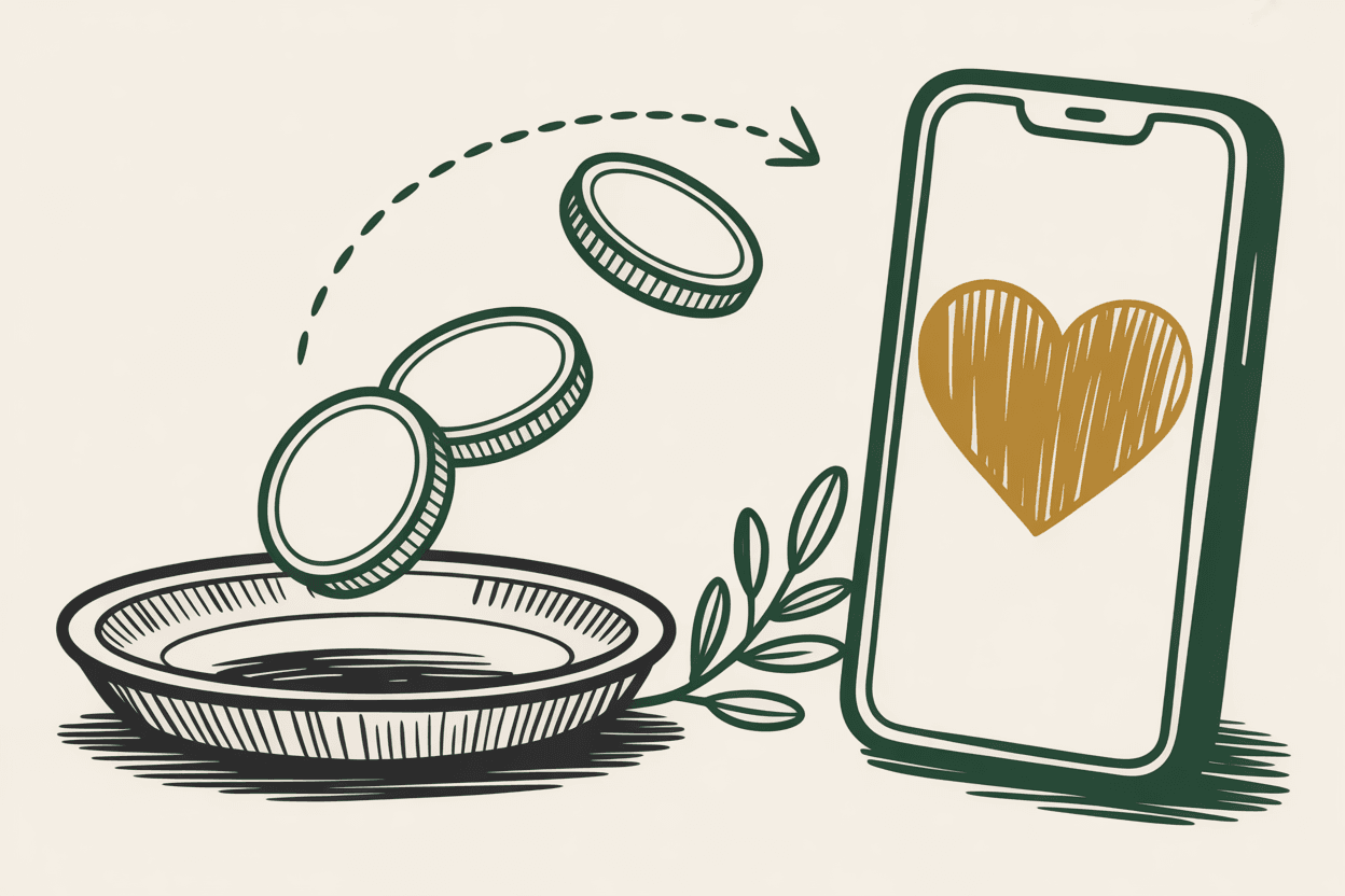
7. Give Online
Online giving should be one click from any page on your site. Put a "Give" button in your main navigation. When someone clicks it, they should land on a page where they can donate immediately.
Keep the giving page simple. Include a brief note about what donations support, a secure giving form or a link to your giving platform (Tithe.ly, Planning Center, Pushpay, etc.), and a note about tax-deductible status.
Common mistake: Burying the give button in a dropdown menu or footer. If someone is moved to give, don't make them search for how. Also, make sure the page works perfectly on mobile. A significant portion of online gifts come from phones.
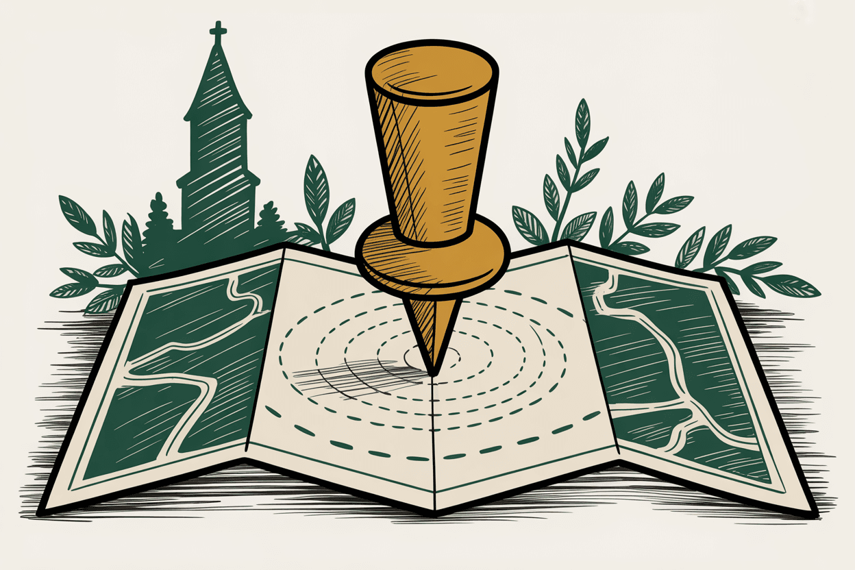
8. Contact / Location
This page needs three things: your physical address, an embedded map, and a way to get in touch. Include your phone number, email address, and office hours.
Driving directions are helpful, especially if your building is tricky to find. ("Turn left after the gas station, and our entrance is behind the main building.") These details matter more than you think for first-time visitors.
Common mistake: Using a contact form with no confirmation message. People fill it out and wonder if anyone received it. Add a simple "Thanks, we'll get back to you within 48 hours" response. Then actually follow up.
9. Staff / Leadership Directory
People want to see who leads your church. Include names, titles, and real photos of your pastoral staff and key leaders. A brief bio (two to three sentences) helps visitors feel connected before they arrive.
Use actual photos, not headshots from 2009. They don't need to be professional studio portraits. A well-lit photo taken with a phone in front of a clean background works fine.
Common mistake: Only listing the senior pastor. If your children's director, worship leader, or office administrator interacts with visitors, include them. People want to know who they'll meet.
10. Blog or News Section
A blog can be a powerful tool for your church. It's great for SEO, it keeps your site fresh, and it gives your pastor a platform beyond Sunday morning.
But here's the honest truth: only add a blog if you'll maintain it. A blog with three posts from 2021 makes your church look inactive. If you commit to it, aim for two to four posts per month. Share sermon recaps, event announcements, devotionals, or community stories.
Common mistake: Starting strong and abandoning it. If you're not sure you can keep it up, start with a simple "News" section for announcements instead. It sets lower expectations and is easier to maintain.
Putting It All Together
You don't need to build all ten pages at once. Start with the ones visitors need most: Homepage, About, Plan Your Visit, Contact, and Give Online. Then build out the rest as your team has capacity.
The goal is a website that answers a visitor's questions before they have to ask. If someone can find your service times, understand what to expect, and get directions in under sixty seconds, you're ahead of most church websites.
Wondering what all of this costs? Our breakdown of church website pricing covers what to expect whether you're DIY-ing or hiring a developer.
Sources
- •Pew Research Center, "How U.S. Religious Composition Has Changed in Recent Decades" (pewresearch.org)
- •Tithe.ly, "The State of Church Online Giving" (tithe.ly)
- •Google, "How People Decide What to Buy" (thinkwithgoogle.com)
- •WebAIM, "The WebAIM Million: An Annual Accessibility Analysis" (webaim.org)