Donation Page Design That Actually Converts: A Data-Driven Guide
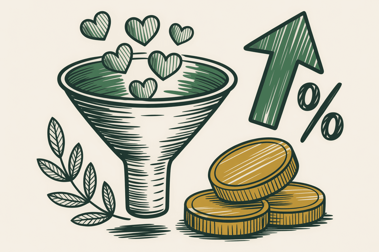
Your donation page is the most important page on your nonprofit's website. It's also probably the most neglected.
Most organizations spend months perfecting their homepage, crafting their mission statement, and curating their photo gallery. Then they slap a default payment form on a blank page and call it a day. The result? Abandonment rates that would make an e-commerce company panic.
The average online donation page converts at roughly 8% to 16%, depending on the source. That means the vast majority of people who click "Donate" never finish. Every percentage point you recover is real money funding your mission.
This guide breaks down what actually works, based on conversion data, accessibility research, and patterns from real nonprofit builds.
Why Most Donation Pages Underperform
The biggest killer of donation conversions isn't bad design. It's friction.
Every extra field, confusing label, or slow-loading element gives your donor a reason to leave. And unlike e-commerce shoppers who want a product, donors are giving money away. Their motivation is generous but fragile.
Here are the most common problems we see:
- Too many form fields (name, address, phone, employer, comments, honoree, tribute type...)
- No suggested gift amounts, forcing donors to decide how much from scratch
- Recurring giving buried or hidden entirely
- Forms that break on mobile devices
- Missing trust signals that make donors wonder if the page is legitimate
- Inaccessible forms that exclude people with disabilities
Fix these, and you're already ahead of most nonprofits.
Suggested Gift Amounts: Make Giving Easy
Decision fatigue is real. When someone lands on your donation page, they've already decided to give. Don't make them work to figure out how much.
Present three to four suggested gift amounts as large, tappable buttons. A common pattern that performs well is $25, $50, $100, and a custom "Other" option. The middle option tends to get selected most often, so place your target gift amount there.
Here's what the data shows: pages with preset donation amounts convert 12% to 20% higher than pages with only an open text field. The reason is simple. Preset amounts remove a decision and replace it with a tap.
Tips for choosing your amounts:
- Look at your average online gift size and build around it
- Keep the lowest amount accessible (don't start at $100 if your average gift is $35)
- Add impact language next to amounts ("$50 provides meals for a family of four")
- Make the buttons large enough to tap easily on a phone screen, at least 44x44 pixels
- Ensure each button has clear focus states for keyboard navigation
Recurring Giving: Your Most Valuable Conversion
A one-time $50 donor is great. A monthly $50 donor is worth $600 a year.
Recurring giving should be prominent on your donation page, not tucked into a dropdown or hidden behind a checkbox. The most effective approach is a toggle or tab system at the top of the form that lets donors switch between "One-Time" and "Monthly" with a single tap.
Some nonprofits default to monthly giving. That can work, but test it with your audience first. If your donors skew older or less tech-savvy, defaulting to monthly without clear labeling can feel deceptive and erode trust.
Organizations that prominently display recurring options see recurring donor rates climb from the typical 10% to 15% range up to 25% or higher. That's a dramatic increase in donor lifetime value with a simple design change.
Minimal Form Fields: Cut Everything You Can
Every field you add to your donation form costs you conversions. The math is brutal. Research from the Baymard Institute and similar UX studies suggests that the average checkout has far more form fields than necessary. Most can be reduced to six to eight fields, and better checkout UX overall can improve conversion rates by up to 35%.
Here's what you actually need:
- Email address
- Card number, expiration, CVC
- Billing ZIP code
- Gift amount (already selected via buttons)
That's it for the minimum viable donation. You can ask for a name, but even that is optional for processing a payment.
Everything else, like mailing address, phone number, employer, and dedication fields, should either be removed or moved to the thank-you page as optional follow-up fields. You already have their email. You can collect additional information later.
What about tax receipts? You need an email address to send one. You do not need a full mailing address at the point of donation.
Mobile Optimization: More Than Half Your Donors Are on a Phone
Mobile giving has crossed the 50% threshold for most nonprofits. Some organizations, especially those with strong social media presences, see 60% to 70% of donation traffic from mobile devices.
Yet many donation pages are still designed desktop-first. Small text, tiny form fields, and buttons that require precision tapping on a 6-inch screen.
Mobile donation page essentials:
- Single-column layout (no side-by-side fields on small screens)
- Gift amount buttons that span the full width of the screen
- Form fields at least 48px tall with generous padding
- A sticky "Complete Donation" button that stays visible as donors scroll
- Support for mobile wallets like Apple Pay and Google Pay, which can cut form completion time in half
- Text sized at 16px or larger to prevent iOS from auto-zooming into input fields
Test your donation page on a real phone. Not a browser resize, not a simulator. Pull it up on your phone and try to complete a donation with one thumb. If anything feels awkward, your donors feel it too.
Trust Signals: Earning Confidence at the Moment of Payment
Your donor is about to type their credit card number into your website. They need to feel safe.
Trust signals reduce anxiety at the exact moment it peaks. Missing them doesn't just feel unprofessional. It actively suppresses donations.
Essential trust signals for donation pages:
- SSL certificate: Your page should load over HTTPS. This is non-negotiable. Most browsers now flag non-HTTPS pages as "Not Secure," which is a conversion killer.
- 501(c)(3) status: Display your tax-exempt status clearly. A simple line like "Laurel Community Foundation is a registered 501(c)(3) nonprofit. Your donation is tax-deductible." goes a long way.
- Financial transparency: Link to your annual report, Form 990, or a Charity Navigator/GuideStar profile. Donors who can verify your financial health give with more confidence.
- Recognizable payment processor logos: Stripe, PayPal, or Square logos signal that a legitimate payment processor is handling the transaction.
- Contact information: A phone number or email address visible on the donation page tells donors there's a real organization behind the form.
Research from ConversionXL found that adding security badges to payment forms led to a 12% boost in conversion rates. For nonprofits, where many donors are giving for the first time, this is significant.
Progress Bars for Campaign Pages
If you're running a fundraising campaign with a specific goal, a progress bar is one of the most powerful psychological tools you can add.
Progress bars tap into two motivations. Early in a campaign, they create social proof ("others are already giving"). Late in a campaign, they trigger goal gradient effect, the tendency to increase effort as you approach a finish line.
Best practices for campaign progress bars:
- Show both the dollar amount raised and the percentage toward goal
- Update in real time or near-real time if possible
- Include donor count alongside dollar amount ("247 donors have given $18,450 toward our $25,000 goal")
- When you're past 70% of goal, emphasize the remaining amount ("Only $6,550 to go!")
- Make the progress bar visually accessible with sufficient color contrast and a text alternative for screen readers
One caution: if your campaign is in its very early stages and the bar is nearly empty, consider waiting until you have some seed donations before displaying it. An empty progress bar can discourage giving rather than encourage it.
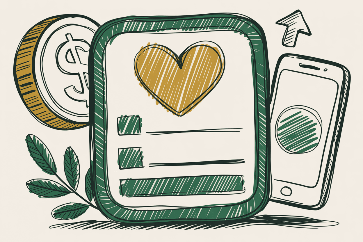
Your Thank-You Page Is Not an Afterthought
The moment after someone donates is the highest point of engagement they'll ever have with your organization online. They just gave you money. They feel good. They're paying attention.
Most nonprofits waste this moment with a generic "Thank you for your donation" message and nothing else.
A high-performing thank-you page should:
- Confirm the gift amount and provide a receipt or receipt confirmation
- Reinforce impact ("Your $50 gift will provide clean water for a family this month")
- Offer a social sharing option so donors can encourage their networks to give
- Invite the donor to subscribe to your newsletter or follow you on social media
- For one-time donors, gently suggest upgrading to monthly giving
- Collect any additional information you skipped on the donation form (mailing address, phone number)
This is also the perfect place to set up a conversion tracking pixel if you're running paid advertising campaigns. Your thank-you page URL is your conversion event.
A/B Testing: Stop Guessing, Start Measuring
You don't need to guess which donation page design works better. You can test it.
A/B testing means showing two versions of your donation page to different visitors and measuring which one converts more donations. Even simple tests can reveal surprising insights.
Good first tests to run:
- Three suggested amounts vs. four suggested amounts
- "Donate" button vs. "Give Now" button vs. "Support Our Mission" button
- Monthly giving as default vs. one-time as default
- Short form (4 fields) vs. standard form (7 fields)
- With progress bar vs. without progress bar
You don't need expensive testing software to start. Google Optimize (or its successors), tools built into platforms like Classy or Donorbox, or even simple landing page tools can run basic A/B tests.
Important: Run each test long enough to reach statistical significance. For most nonprofits, that means at least 200 to 500 conversions per variation. Don't call a winner after 20 donations.
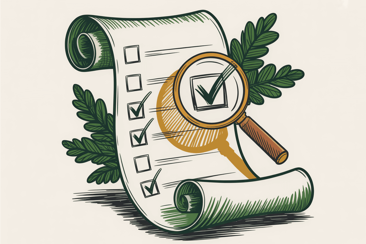
Accessible Donation Forms: A Requirement, Not a Feature
An inaccessible donation form doesn't just create a poor experience. It excludes people from supporting your mission. For nonprofits, that's the opposite of what you stand for.
Accessibility in donation forms is also a legal consideration. The ADA and related regulations increasingly apply to websites, and nonprofit donation pages are not exempt.
Accessible donation form checklist:
- Keyboard navigation: Every element of your form, including gift amount buttons, form fields, and the submit button, must be reachable and operable with a keyboard alone. Tab order should follow a logical sequence from top to bottom.
- Labeled fields: Every input field needs a visible `<label>` element associated with it using the `for` attribute. Placeholder text alone is not a label, as it disappears when the user starts typing.
- Error messages: When a donor makes a mistake (invalid card number, missing field), the error message should appear near the relevant field, be announced to screen readers using `aria-live` regions, and clearly explain what went wrong and how to fix it.
- Color contrast: All text, including on buttons, must meet WCAG 2.1 AA contrast ratios (4.5:1 for normal text, 3:1 for large text).
- Focus indicators: Visible focus outlines on all interactive elements. Never remove the default focus ring without replacing it with something equally visible.
- Screen reader compatibility: Test your form with a screen reader (VoiceOver on Mac, NVDA on Windows). The form should make sense when read aloud in sequence.
Accessible forms tend to be better forms for everyone. Clear labels, logical tab order, and helpful error messages improve the experience for all donors, not just those using assistive technology.
Putting It All Together
Great donation page design isn't about flashy graphics or clever copy. It's about removing every barrier between a willing donor and a completed gift.
Start with the changes that have the biggest impact: reduce form fields, add suggested gift amounts, and make recurring giving prominent. Then move to mobile optimization, trust signals, and accessibility. Test as you go.
Your donation page might be a single page on your website, but it carries the weight of your entire fundraising program. Treat it accordingly.
Sources
- •M+R Benchmarks Study (annual nonprofit digital benchmarks report covering online fundraising conversion rates)
- •Baymard Institute, "Checkout Usability" research on form field reduction and conversion impact
- •ConversionXL, research on trust signals and e-commerce conversion rates
- •Web Content Accessibility Guidelines (WCAG) 2.1, W3C Recommendation
- •Google/Ipsos research on mobile user behavior and form abandonment
- •Network for Good and Classy platform data on recurring giving trends